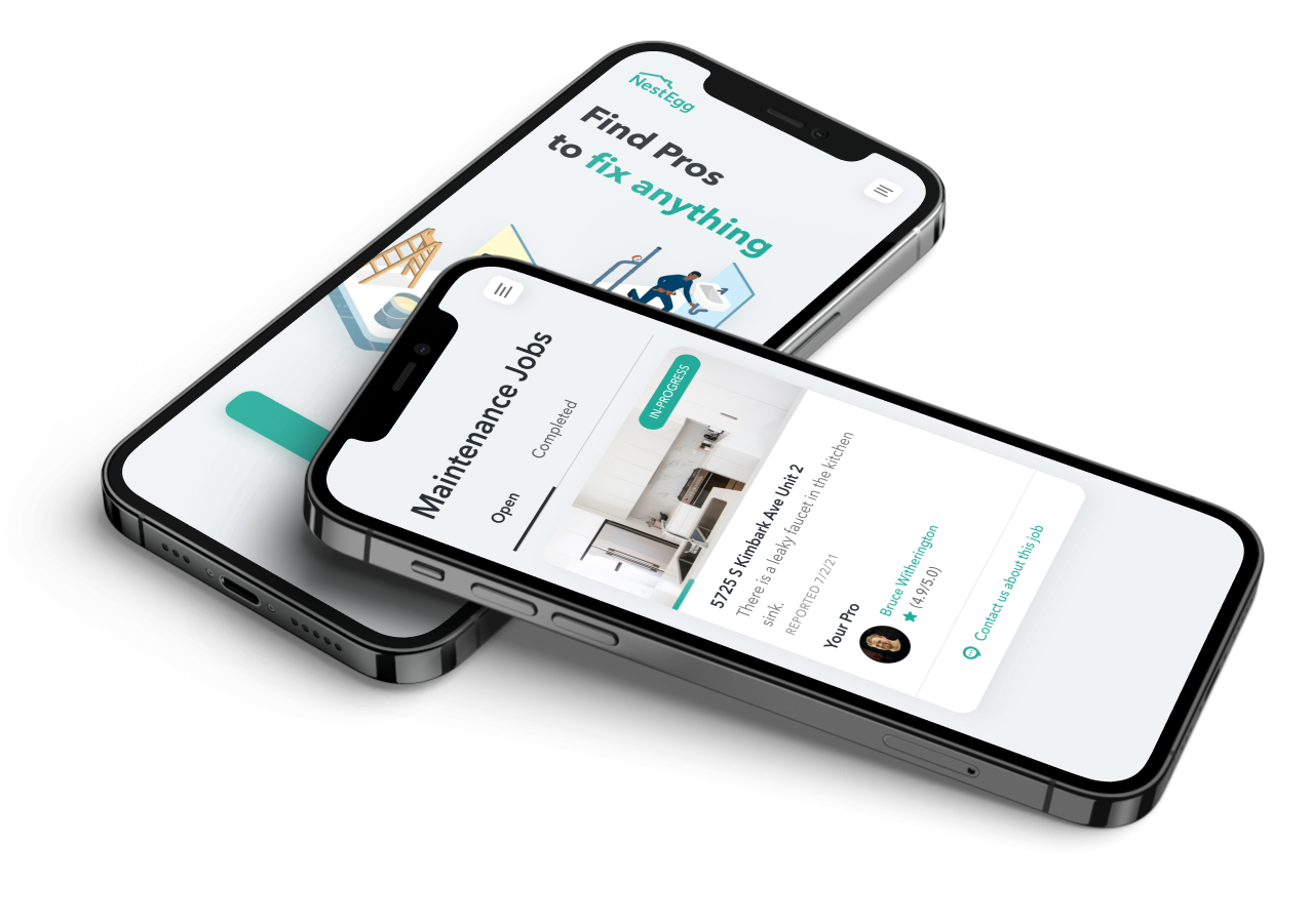
Maintenance Flow Redesign
Context
NestEgg aims to help ordinary people achieve financial independence through real-estate. We do this by empowering mom and pop landlords to easily self-manage their own portfolios. (To learn more, check out our website.) We also value putting human relationships at the center of the rental experience, doing with long-term renting what AirBNB did with short-term stays.
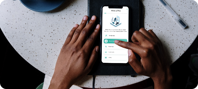
One of NestEgg's key features is on-demand maintenance coordination. When a resident reports a maintenance issue, NestEgg handles it so that the landlord doesn't need to be bothered - finding local Pros, handling scheduling, and providing live in-app updates to the landlords.
Problem
A significant percentage of our users were not using our maintenance feature, which was the lynch pin of our business model. We wanted to figure out why.
My Role
I worked as the principle UX Researcher and Designer on this project, collaborating with our Product Manager, Chris Le, and the rest of our design team.
Step 1: Investigation
I started with some initial hypotheses:
- Visibility - Users may not know that the maintenance feature exists.
- Education - Users may not understand what our maintenance product can do for them.
- Friction - Users may find our existing maintenance flow too confusing.
Competitor analysis of companies like Thumbtack, Jiffy, and Angie's list, was also helpful in identifying common patterns.
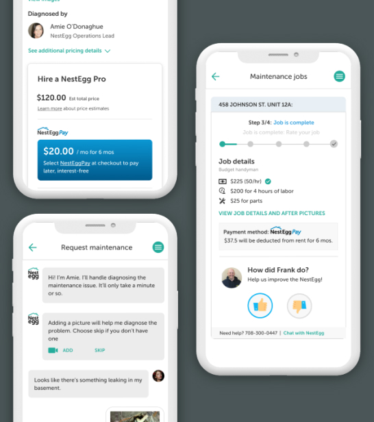 Old designs
Next, we analyzed tracking data, which showed high drop-off at the start of our maintenance funnel. We were using a 'chat-bot' interaction for landlords to report maintenance issues, and many of our users didn't make it past the first couple of messages.
Step 2: User research
Research objectives
Discover how users are interacting with our maintenance product, with particular focus on discoverability, friction, and education.
User characteristics
Existing landlords using our application.
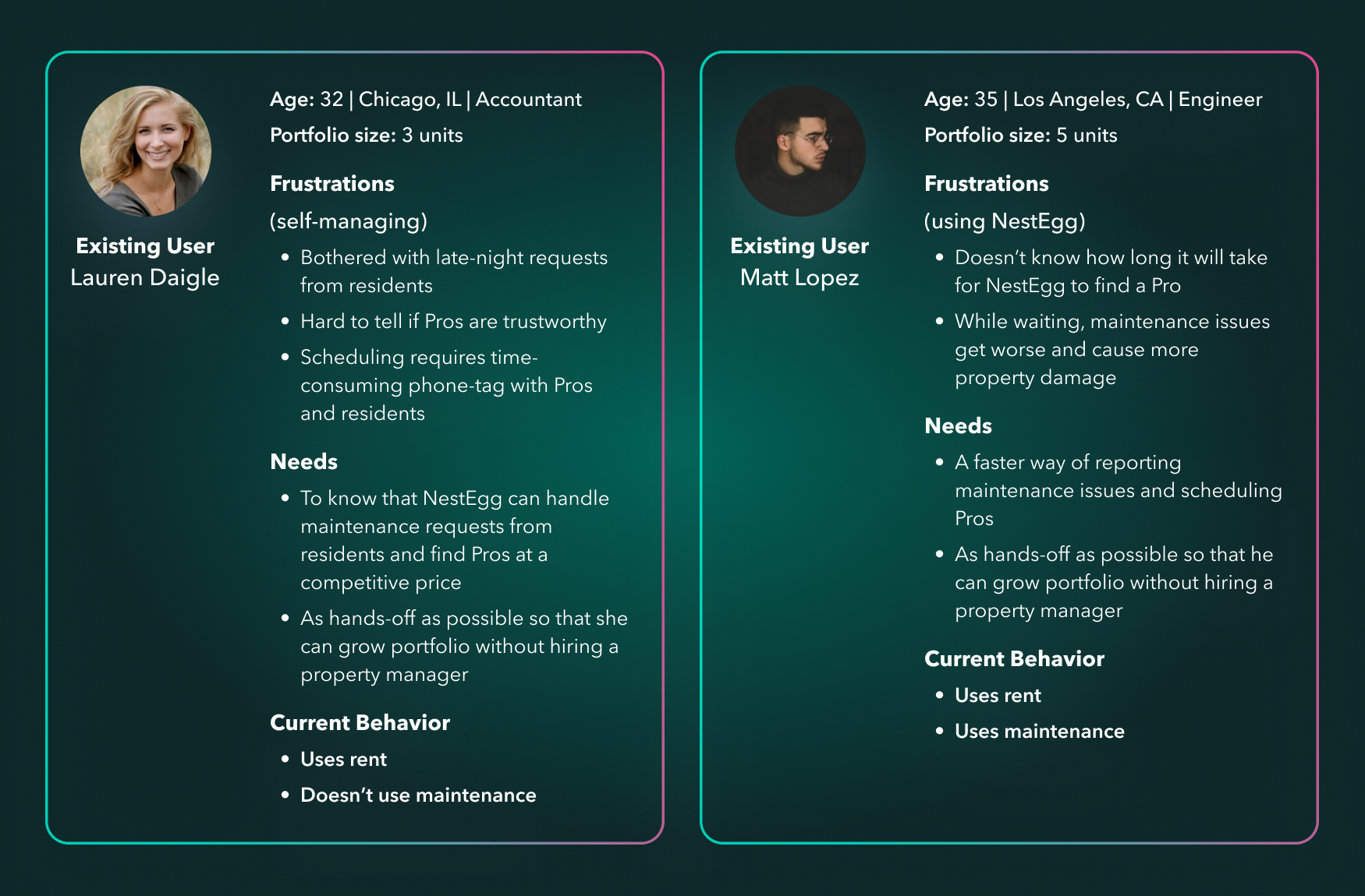 User personas
User interviews
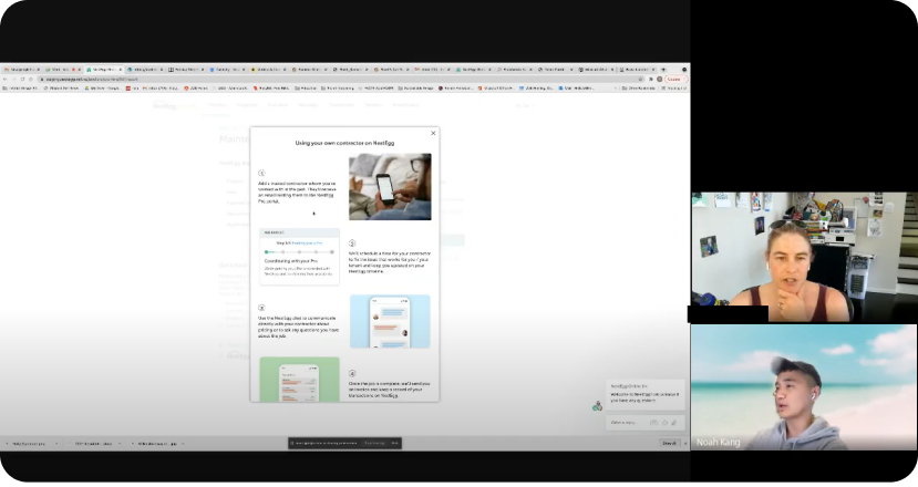
In interviews with our research group we gave the users common use cases (e.g., ‘you have a broken faucet. How would you use NestEgg to get this issue fixed?’) and examined how they interacted with the App. We also surveyed users about their experience with NestEgg.
 User interviews
We consolidated and prioritized our findings, based on criteria like the estimated impact of each issue and how easily we thought we could solve it.
Top 3 findings
| Problem | My proposed solution |
|---|---|
| Many users were not aware that we offered a maintenance service. Some users could not find where they could order a Pro or view past maintenance requests. | Increase discoverability of maintenance service. |
| Users did not understand how our maintenance service worked. Some users thought that we only provided a way for landlords to be notified about maintenance requests, and didn't realize that they could also hire Pros on NestEgg. |
|
Maintenance process was too long, with multiple drop-off points.
|
|
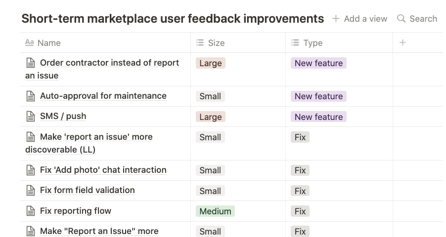 Organizing research findings in Notion
Step 3: Redesign
I began with flow-charts and lo-fi mockups, which I honed with the help of internal testing with our team, as well as with third-party testers.
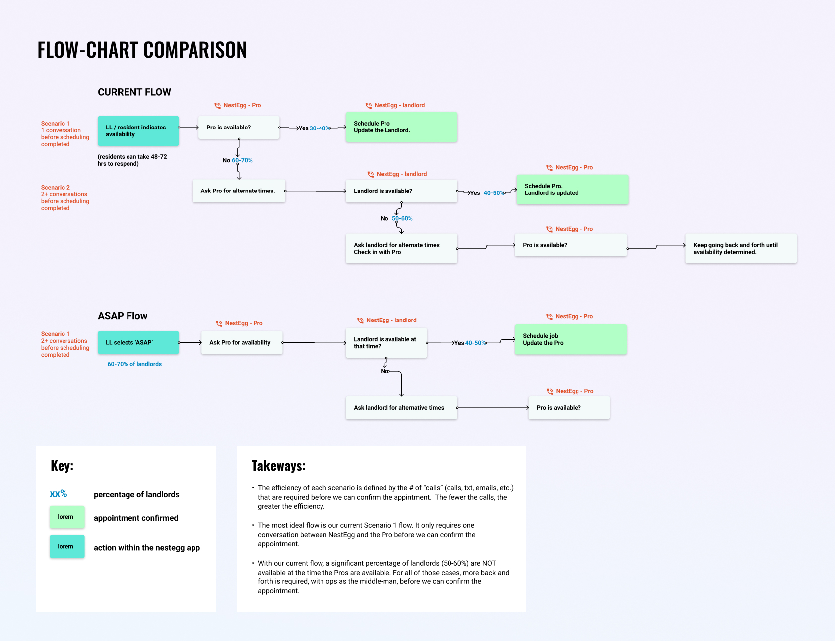 ASAP flow comparison
Summary of changes
Increased Discoverability:
Changes we made to increase visibility of the maintenance feature:
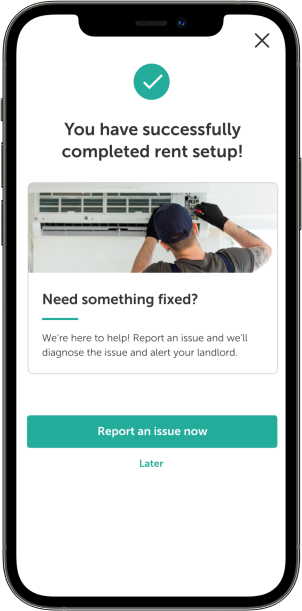
Integration with rent
To target users who didn't know about NestEgg maintenance, I added a cross-sell module to the rent onboarding flow.
Top-level visibility
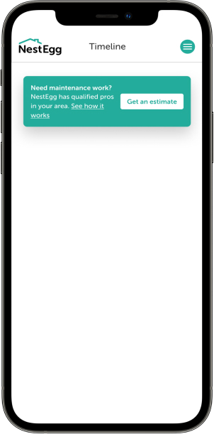
I added a Timeline module that would be the first thing that users see when they open the App. In a later sprint, we revisited the Timeline and turned it into a more useful dashboard.
Takeover
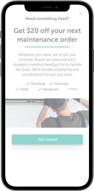
We decided against a takeover ad on the homepage after receiving negative user feedback on the change. While it elevated the visibility of maintenance, and may have helped our bottom-line, it was not user-centered.
Marketing campaign:
I know that a key part of driving greater adoption of our maintenance service was marketing, so I intiiated an email coupon campaign with our marketing team to drive first-time adoption of maintenance. (The data showed that once a landlord used maintenance once, they were likely to be a repeat customer.)
Simplified issue reporting:
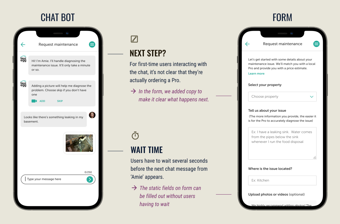
One of the key changes we made to our maintenance flow was to replace the chat-bot with a form. Our hypothesis was that many users would actually prefer a form to a chat-bot, due to the speed with which a form can be completed. We developed the form with plans to AB test it against our chat bot.
 chat vs form
Decreased time-to-price:
After users reported a maintenance issue, they would need to wait for our ops team to generate a price (up to 24 hrs). But by that time, many users would already start looking for Pros on their own. I realized that if we could automatically show the user a price estimate based on their job type (based on data abt prices of past jobs, categorized by type), we could show a price to landlords immediately, cutting 'time-to-price' from 24 hours to minutes.
Old flow
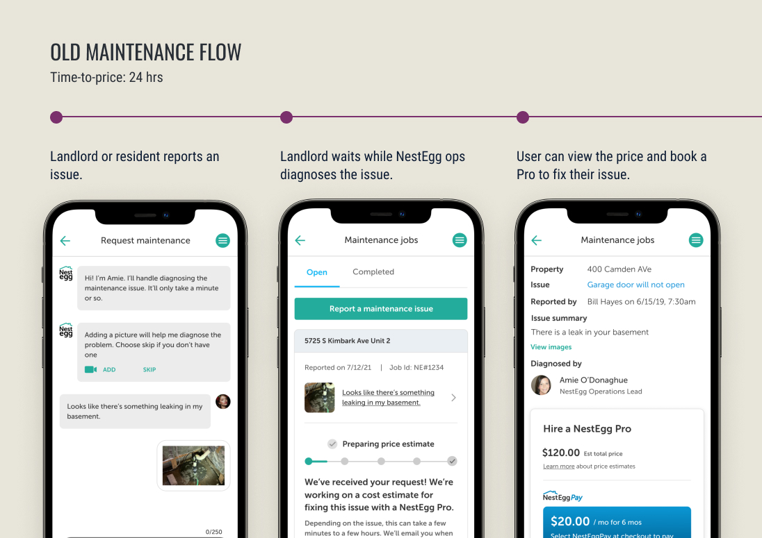
After a user reports an issue, they have to wait for up to 24 hours before they can view a price and book a Pro.
 Old flow with chat
New flow
After reporting an issue, user sees a price instantly (based on historic averages for the trade that they selected) and can book a Pro immediately!
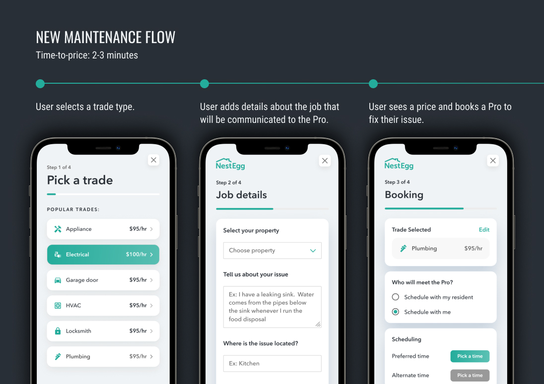 New flow with up front price information
Side-by-side comparison
conclusion
Were we successful?
We were able to transform the maintenance service in a way that vastly improved our users' experience. We directly addressed some user pain-points, saw increased up-take of our maintenance product, and received positive feedback about the changes from our users.
One takeaway for the future is to improve our AB testing framework so that we can have more data to back our design choices.
